Bedroom colour ideas: a bespoke guide
Your bedroom is a haven for rest, rejuvenation and reflection. The colours you choose can play a pivotal role in shaping your bedroom’s atmosphere, profoundly impacting your overall wellbeing. The right hues can lull you into a more restful sleep and elevate your mood when you wake up. Conversely, the wrong colour choices can lead to restlessness, a sense of unease and a space that feels far from tranquil.
At Premier Crafts, we understand the transformative power of colour and believe that your bedroom should be a true reflection of your individual style and needs.
Follow our comprehensive guide to bedroom colour ideas below, empowering you to make informed and inspired choices for one of the most important rooms in your home.
The colour wheel basics
Before we dive into specific bedroom colour ideas, it’s essential to grasp the fundamental principles of the colour wheel. This visual tool illustrates the relationships between different colours and can help you create harmonious and visually appealing colour schemes within your home.
Primary colours
These are the three core colours – red, yellow and blue – that cannot be created by mixing other colours. They are the foundation of all other hues.
Secondary colours
These are created by mixing two primary colours. Red and yellow makes orange, yellow and blue makes green, and blue and red mixed together is purple.
Tertiary colours
Tertiary colours are formed by mixing a primary colour with an adjacent secondary colour and can create a variety of hues.
Understanding these basic relationships will be invaluable as we explore different bedroom colour ideas.
Colour psychology
Colours have a significant impact on our emotions and psychological states. When choosing bedroom colours, considering these associations can help you create the desired atmosphere.
Blues and greens for calmness
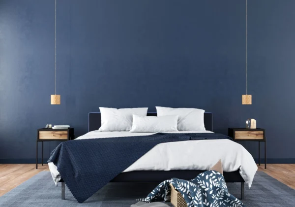
Blues are often associated with tranquillity, peace and stability. Lighter shades can help your bedroom feel airy and spacious, while deeper blues can be soothing and introspective. Whether you’re looking for a colour to evoke clear sky or the ocean, blue hues can promote relaxation and better sleep.
Greens are associated with nature, growth, balance and harmony. Green is restful and restorative and can bring a sense of the outdoors.
Neutrals for sophistication
White provides a versatile and timeless backdrop that can make a room feel larger and brighter. It allows your furniture and decor to take centre stage, however, too much stark white can feel clinical, so it is important to layer with different textures and warmer white tones.
Another popular neutral is grey, which offers neutrality and balance. With a vast spectrum of shades, it can create a modern and elegant feel, especially when complemented by accent colours.
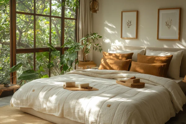
Beiges and creams evoke warmth and timeless comfort. These earth-toned neutrals create a cosy and inviting atmosphere and can be reminiscent of the texture of sand or natural linen.
Pinks and purples for romance
Softer shades of pink can be romantic and inviting, whereas purples like lighter lavenders and lilacs create feelings of calm and serenity. Deeper plums and violets add a touch of drama and opulence. Combining them creates a soft, dreamy, and balanced atmosphere that can be both comforting and elegant.
Yellows and oranges for energy
These colours are often associated with happiness, optimism, creativity and energy. Brighter hues will likely be too stimulating for a bedroom and could interfere with sleep. Consider opting for softer, more muted tones, such as buttercup or terracotta to add warmth and cheerfulness.
Blacks and dark greys for drama
Darker colours like this can add power, drama, and a sense of grounding to a bedroom. While too much of these shades may be overwhelming, they are best used as sophisticated accents to avoid making the room feel too enclosed.
Considering light and room size
The way colour is perceived is significantly influenced by both natural and artificial light, as well as the dimensions of your bedroom.
Natural light tends to make colours appear brighter and more vibrant. A room with abundant sunlight can handle richer colours, while a darker room might benefit from lighter hues to prevent it from feeling gloomy.
Artificial light, on the other hand, can alter the undertones of colours. Warm-toned light can bring out the yellow in colours, while cool-toned light can emphasise blues and greys. Always test paint swatches under both natural and artificial light at different times of the day to get a true sense of how the colour will appear.
The size of your bedroom is also a crucial factor. Lighter colours such as whites, creams and pale blues are generally recommended for smaller bedrooms as they can create an illusion of spaciousness and airiness. On the other hand, you can be more experimental with larger bedrooms and incorporate richer, deeper colours to create a cosy atmosphere.
Factoring in undertones
Every colour has an underlying tone, either warm (red, yellow and orange) or cool (blue, green and violet). Mixing colours with opposing undertones can sometimes feel jarring, while pairing colours with similar undertones creates a more cohesive and balanced look. For example, green is generally considered a cool colour because it contains blue, but it can have different undertones. A yellow green, like a fresh spring leaf, has a warm undertone. This means it will often pair beautifully with other warm colours like sunny yellows and earthy browns, creating a vibrant and natural feel.
Exploring different bedroom colour ideas
We will now consider different approaches to colour pairing and their resulting impact on bedroom mood and design.
Monochromatic
A monochromatic colour scheme utilises different shades, tints and tones of a single base colour.
For example, a monochromatic blue bedroom would feature various shades of blue. The walls could be a soft sky blue, the bedding a deeper navy, the curtains a textured indigo and accents like cushions and throws in lighter tints of powder blue and grey blue.
Monochromatic schemes can create a sense of spaciousness and are easy on the eyes. This harmony can make them ideal for bedrooms. We recommend introducing texture through different fabrics and materials to add visual interest and prevent the scheme from feeling flat.
Analogous
Analogous colour schemes combine colours that are adjacent to each other on the colour wheel. This is often found in nature.
For a bedroom, this could mean a feature wall in a soft blue green, with accents of varying shades of blue and green, such as deep teal bedding and light sage green curtains.
It is usually best to choose one dominant colour and use the others as supporting accents.
Complementary
Complementary colour schemes pair colours that are directly opposite each other in the colour wheel, such as blue and orange, red and green, or yellow and purple. This creates a bold and vibrant contrast.
This is not advised for a bedroom, as they may be too visually stimulating and not conducive to relaxation. You could, however, choose muted tones. For example, instead of bright blue and orange, you could opt for muted versions, like a dusty blue wall with terracotta accents in the decor and soft furnishings.
Triadic
A triadic colour scheme uses three colours that are evenly spaced on the colour wheel, such as green, orange and purple, or blue, red and yellow. This creates a balanced and playful scheme.
If used subtly, this could work in a bedroom. For example, the room could feature soft, off-white walls with subtle accents of muted green in the furniture, a touch of dusty rose in the throws and cushions and warm gold in the decor.
Neutral with pops of colour
These bedroom colour ideas offer a versatile approach through a neutral base (whites, greys and beiges). The neutral colour could be applied to the walls and larger furniture pieces, with bolder colours in the textiles or within a single feature wall.
This scheme offers flexibility and allows you to easily update the look of your bedroom by changing the accent colours. It provides a calming foundation while allowing for personal expression through bolder hues.
Tailoring colour to your personal style
Ultimately, the best bedroom colour scheme is one that resonates with you on a personal level and meets your individual needs.
You may be drawn to bold and vibrant colours, or maybe you prefer more subtle and calming hues. Your natural inclinations can provide valuable clues.
You may wish for your bedroom to feel serene and restful, or you may want the space to energise you and boost your creativity. Think about the desired mood and atmosphere when considering bedroom colour ideas.
You should also take into account the colours and styles of your existing furniture, bedding and decor. Consider whether you want the walls to blend seamlessly with your furnishings or provide a contrasting backdrop. If you’re looking to revamp your current furniture and improve your storage space, we can support you with bespoke cabinetry.
Practical tips and considerations
Once you have a colour scheme in mind, here are some practical tips to ensure a successful transformation:
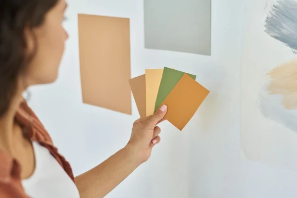
Test colours
Never commit to a paint colour based solely on a small swatch in a store. Purchase sample pots of your top choices and paint large swatches on your bedroom walls. Observe how the colours look under different lighting conditions throughout the day and evening. Live with the swatches for a few days to ensure you truly love the colour in your space.
Consider a feature wall
This can be a great way to introduce a bolder colour or a striking pattern without overwhelming the entire room. Choose the wall you want to highlight – often the one behind the bed – and paint it in a contrasting colour or apply a patterned wallpaper. This can add visual interest and depth to the room.
Explore texture
The texture of your walls can influence how colour is perceived. Matte finishes tend to absorb light, resulting in a velvety look, while sheen finishes reflect light, making colours appear brighter and more vibrant. Consider textured paint or wall coverings to add another dimension to your colour scheme.
Coordinate bedding, curtains & accessories
Your wall colour is just one part of the overall picture. Consider how it will coordinate with your bedding, curtains, rugs and other accessories. Aim for a balanced and harmonious look by choosing colours and patterns that complement each other.
We offer more tips for bringing your dream bedroom to life on our website.
Combining colour with quality craftsmanship
At Premier Crafts, we believe your furniture should seamlessly integrate with your ideal bedroom aesthetic, where colour plays a pivotal role. Beyond crafting exquisite, made-to-measure wardrobes, dressers, and more, our design expertise extends to helping you envision the perfect colour palette for your space.
Our team offers personalised consultations, guiding you through a vast selection of colours and finishes to complement your chosen cabinetry and overall design. Whether you desire colours that enhance the natural beauty of the wood, create a specific mood, or perfectly accent your unique style, we provide the integrated design support to bring your complete bedroom vision to life. Let us craft your dream cabinetry and guide you in selecting the ideal colours to create your personal haven.
Back to Blog